
.gif)

Key Takeaways
How times have changed and how we expect each and every aspect of our life to be technology oriented. The scenario of online food ordering has also evolved to accommodate this need. If there is a product or service we need to utilize the chances are that “there is an app for that”. With the conversion of users from desktop and laptop to mobile has created a priority for “mobile-first” approach.
The reason is clear: mobile is the place where everyone is.
People want it arranged, organized and packed inside a mobile display. At least the idea is to provide access to everything from the confines of a mobile screen.
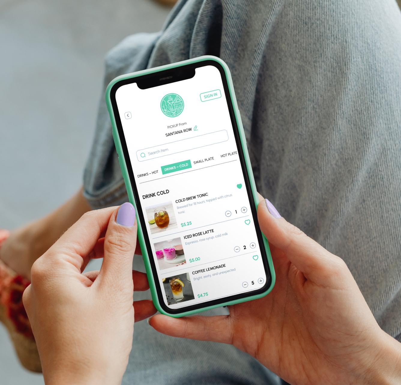
The number of smartphone users in the world in 2017 is 2.32 billion. Sadly, only 30 percent of medium business websites are mobile friendly. If you don’t have it mobile-friendly then you can imagine the business volume you are missing out on. Millions of people all over the world acknowledge the convenience of using online ordering systems. A lot of food joints have witnessed increased sales after incorporating online ordering into their business strategy. This has lead to increased usage of custom mobile apps for online ordering.
- Often users have complained about how a restaurant’s website poses problems when viewed on Smartphone.
- Content designed for large-screens puts off mobile phone users. It also leads to a longer page load time due to unnecessary downloads.Having anything that takes more than a couple of seconds to load definitely upsets your conversion rate.
- Users also complain when they there is a difference in features provided in desktop and mobile version of a website. Nobody wants to read a skimmed off version of a webpage on their phones. Everybody wants access to complete services uniformly across all available platforms.
You must make sure that the following features are there in your online ordering system.
- It should support a variety of devices. Do not limit your website design limited to desktop and laptop usage. Handheld devices are the devices which are used by the majority to surf the internet. Get your website build around various devices so it makes online ordering a pleasant experience for your customers.
- Make it easier for your customer to find the crucial “food information”. Planning title pages is a difficult thing to do but you should make the ordering process as easier that is practically possible.The key to a good website is managing the content is according to the device the customer is using.
- Cutting down on the advertisements’ content in mobile websites would be a preferred option because it often bugs users. They can always be used in the original websites because having ads in mobile websites might not be a good strategy for online ordering for restaurants.
- It is essential to limit any advertisement content in mobile websites. It increases page load time and more often annoys the users. Having too many advertisements in your website is not a good idea.
- It is always a good approach to visualize things from the customer’s perspective. Whenever you get a chance, ask your customers about the website or the app. And seek any inputs that could lead to upgrading the user experience on the website and the app.
Creating device-friendly websites is a great strategy as it opens a completely new market opportunities. Online ordering systems have been warmly received by foodies everywhere and a little effort from your side and you can definitely improve your business by using it. Restolabs is a powerful online ordering system for restaurants. We also design restaurant websites that are compatiable over a wide range of devices. For any queries you can reach us at info@restolabs.com.

Team Restolabs is a group of hospitality tech experts, strategists, and innovators dedicated to helping restaurants thrive in the digital age. With deep expertise in branding, growth, product development, and restaurant technology, we provide insights on scaling, streamlining operations, and enhancing customer experience.
Frequently Asked Questions


.jpeg)


.webp)

.svg)
.webp)