Key Takeaways
When it comes to the online menu of a restaurant, infusing it with creativity and strategic thinking is essential to captivate customers and drive them to place orders. The menu serves as a key motivating factor in their decision-making process. Whether it is seamlessly integrated on the homepage or presented on a separate page of the website, it should offer effortless navigation for new visitors while effectively conveying the range of dishes, specialties, and detailed descriptions of each item. A well-balanced composition of visual elements adds further allure to the menu's presentation.
If you find yourself in the early stages of digitizing your restaurant and uncertain about the ideal online menu design, seeking inspiration from successful establishments that have perfected their menu layouts can prove invaluable. To assist you in this endeavor, I have curated a selection of eight exemplary restaurant menu examples. Take a moment to explore these sources of inspiration, make note of their noteworthy features, and use them as a foundation to create a menu that harmonizes seamlessly with your restaurant's brand image.
By leveraging the power of creativity and drawing insights from successful industry peers, you can craft a compelling online menu that entices customers and aligns with the unique essence of your restaurant.
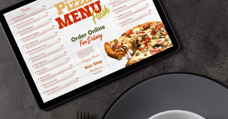
Best 8 Restaurant Menu Examples
1. AB Crepes - Simple and Gorgeous
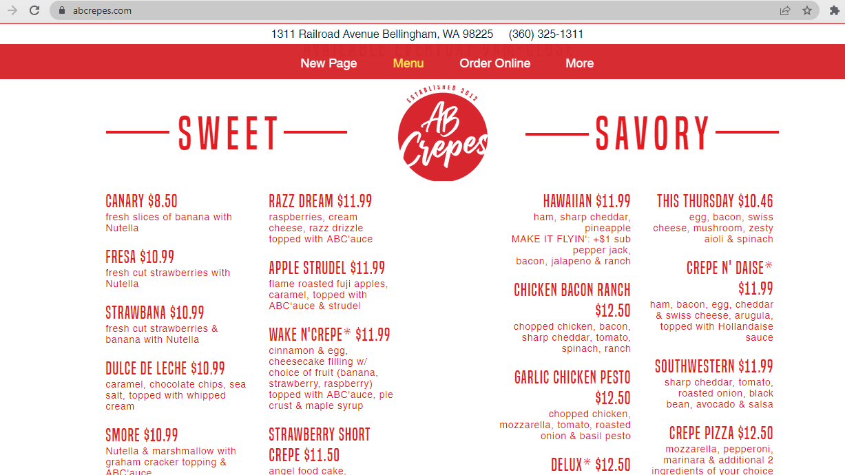
While images can undoubtedly enhance the visual appeal of your restaurant menu, they are not indispensable. When customers are dining in person at a restaurant, they often have specific inquiries about the dishes. It is crucial for your online menu to address these common questions effectively, ensuring that customers have a clear understanding of what to anticipate.
AB Crepes serves as an excellent illustration in this regard. Despite the absence of images, they have creatively named offerings such as 'This Thursday' and 'Crepe N' Daise.' Moreover, they provide comprehensive ingredient information in a captivating manner, striking a balance between informative and engaging content. The result is a menu that exudes a sense of organization, leaving a lasting positive impression.
By focusing on delivering substantial information and employing inventive naming conventions, you can create a remarkable online menu that captivates customers, even without relying on imagery.
2. B Good - Minimalistic & Easy
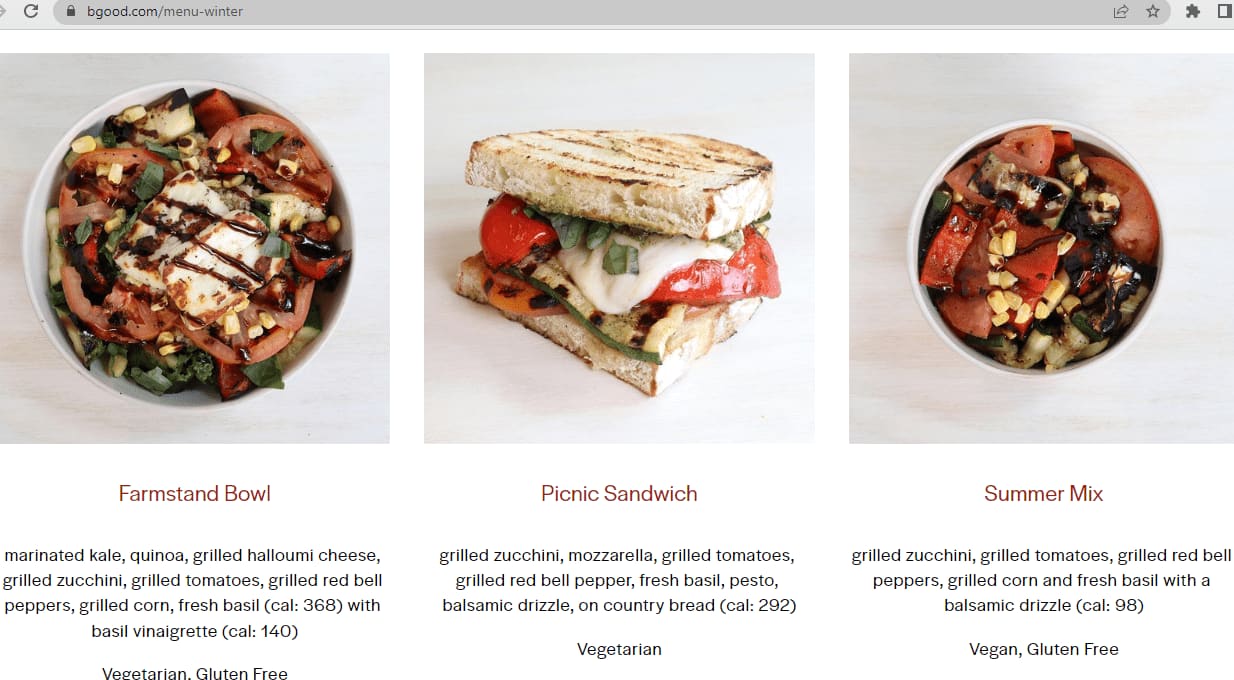
Innovative strategies can be employed to enhance the impact of your restaurant's menu. Rather than displaying pricing alongside each food item, you can adopt a different approach that accentuates the appeal of your delectable dishes and their flavors.
B. Good, for example, opts to initially withhold pricing information. By doing so, the customer's attention remains undiverted from the essence of the menu, allowing them to leisurely explore the items available and their corresponding ingredients. Consider implementing a system wherein prices are revealed only when the customer actively initiates the ordering process. This approach preserves the focus on the menu's content and encourages customers to engage with your offerings.
By implementing such a strategy, you can create an environment where customers can fully appreciate the culinary delights you offer while ensuring pricing information remains readily available when they are ready to make a decision.
3. Pacific Catch - Thoughtful & On-point Branding
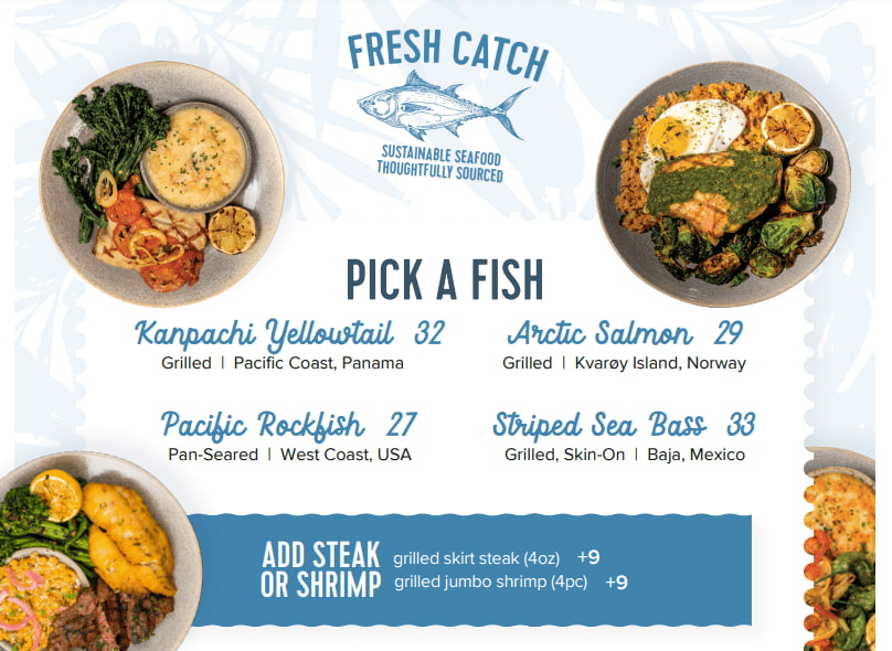
To align your online food menu with your brand identity, consider incorporating elements of your mission and vision. A prime example is Pacific Catch, which skillfully integrates descriptors such as 'thoughtfully sourced' into its menu, effectively communicating its commitment to sustainability. Furthermore, this seafood restaurant's menu captivates with its visually appealing design. From meticulous categorization to an appealing color palette, well-chosen fonts, and enticing images, every aspect is carefully crafted to entice and engage customers, ultimately compelling them to click the enticing 'order now' button.
By infusing your menu with brand-aligned messaging and employing thoughtful design choices, you can create an online food menu that not only reflects your mission and vision but also entices customers to explore and indulge in your offerings.
4. Noodle Bar - Detailed & Effective
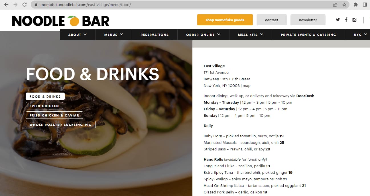
Noodle Bar by Momofuku cleverly organizes their food offerings into four distinct categories, allowing customers to easily explore each one. By simply clicking on a category, the complete list of dishes within that category promptly appears. The restaurant effectively communicates its dining and ordering timings, presents its food items in a clear and concise manner, and avoids overwhelming the menu with excessive visual elements. Despite its simplicity, the menu excels in providing a seamless navigation experience and a clutter-free interface, making it highly functional and user-friendly.
Through its thoughtful organization and user-centric design, Noodle Bar by Momofuku exemplifies how a menu can be both straightforward and effective, enhancing the overall dining experience for customers.
5. Giraffe -Playful & Concise

Giraffe presents another compelling example of a well-designed restaurant menu. Upon clicking on the 'Menu' tab, you are promptly directed to a page where you can effortlessly navigate through various menu categories, such as breakfast, brunch, drinks, and more. Additionally, Giraffe offers the convenience of selecting a portion size that suits your preference, whether it's nibbles, small plates, mains, and so on.
What sets Giraffe apart is their attention to detail in providing informative descriptions for each dish. Accompanied by a concise copy, every item on the menu highlights its key ingredients and even includes the total calorie count. This transparency not only caters to customers who value knowing the nutritional information but also appeals to those who are mindful of their calorie intake. Giraffe's menu successfully strikes a balance between offering a diverse selection of dishes and catering to the health-conscious needs of its clientele.
By following the example set by Giraffe, you can create a menu that not only offers a seamless browsing experience but also empowers customers to make informed choices about their dining preferences.
6. Bon Bouquet Cafe - Creative & Attractive

Bon Bouquet Cafe’s website is a party of colors. The website menu has a beautiful color combination and it's designed with functionality in mind. All items are divided into three clickable heads—brunch, desserts, and drinks. This makes navigating through the menu quick and easy. Below each dish, you'll find a clear description of what will be offered on the plate. They have mentioned the add-ons at the bottom, which is pretty seamless to access. While the top part of the menu draws in the customer with vibrant images of their food, the power part, which contains the menu, has a soothing visual appeal, creating a balanced proportion.
7. Pizzeria Vetri - Simple & Elegant
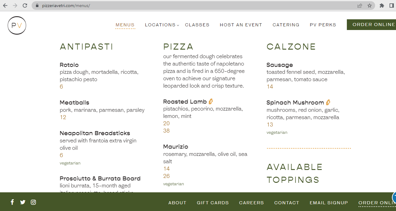
When it comes to pizza, you don’t need to say much. Just mention the basic details, such as the type of meat, cheese, dough, and key ingredients, and your customers will know what they’re getting. Pizzeria Vetri follows this exact approach for their online menu—it’s straightforward, clutter-free, and at the same time, includes all the information a customer needs to place an order. The minimalist aesthetics are on point, showcasing that you don’t always need a lot of visual elements to make your online menu stand out.
8. Sweetgreen - Visually Appealing & Informative
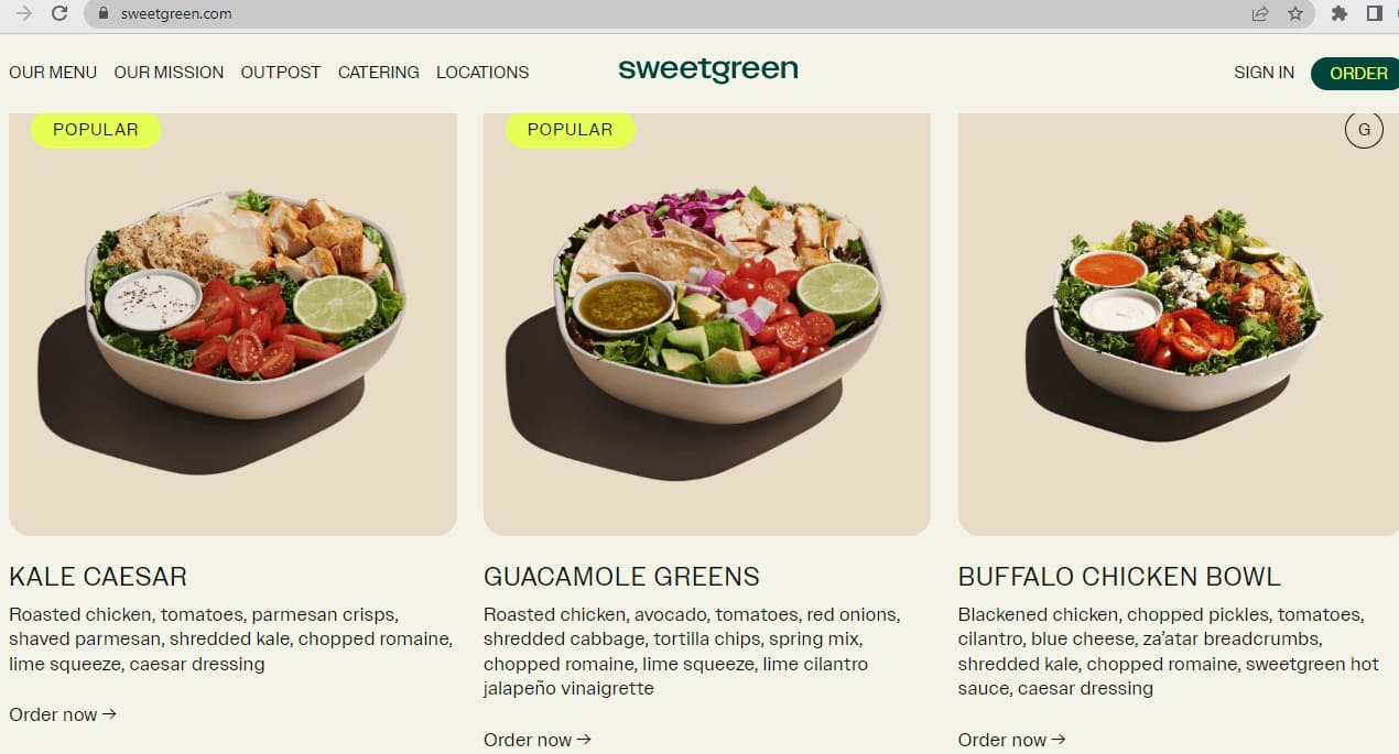
You may not be a big fan of salads, but Sweetgreen’s menu manages to make even green salads appear delectable. The moment you lay your eyes on the home page, you'll be hooked to scroll through the salads, warm bowls, and side dishes they have to offer. Each item is listed with an attractive image and a clear description of what it contains—just the way customers like it. The vibrant color of the salads creates a nice contrast with the muted backdrop.
Enhance Your Restaurant Menu and Increase Profits
To drive up sales, your website must offer a seamless user experience and your menu has to be both attractive and compelling. Follow the restaurant menu examples we mentioned above to understand which is the best way for price positioning, how to achieve a color balance, which fonts look better with your brand image, whether should you add images or not, and most importantly, how you should place the menu on the website.
It might require a bit of trial and error in the early days, but you can always improve by incorporating customer feedback and analyzing the current website traffic. When you take your restaurant online with a platform like Restolabs, you can customize your menu to make it on-brand, offer features like pre-ordering, display time-sensitive offers, and most importantly, deliver an impeccable customer experience. Get started with Restolabs for free.
💡You Might Also Like...
👉 Should You Overhaul Your Takeout Menu?
👉 5 Ways To Drive Sales And Generate Engagement Through Contactless Digital Menu
👉Menu Photos Are Key To Growing Online Sales For Restaurants
Frequently Asked Questions
A successful menu is easy to navigate, highlights profitable items, and uses appealing visuals and descriptions to entice customers.
Focus on a balanced layout, offer variety, and use strategic pricing to maximize both customer satisfaction and profitability.

.gif)

%2520(10).png)




.png)


