
.gif)
Key Takeaways
1. In 2025, an online presence is crucial for attracting customers and keeping your restaurant visible. Without it, you’re missing out on potential diners who are just a few clicks away.
2. Make your website easy to navigate with features like online reservations, a clear menu, and mobile optimization. A seamless, user-friendly site keeps customers coming back.
3. Use your website to tell your restaurant’s story, showcase customer reviews, and offer easy online ordering. This helps build a connection with your audience and encourages repeat business.
As a restaurant owner, you're passionate about delivering exceptional dining experiences. But, what happens when potential customers can't find you online? Without a website, your restaurant and the wonderful services you offer will remain hidden and you could be missing out on the very customers who are searching for you. This means that your online presence is no longer optional—it's essential to grow and thrive.
It's 2025, and having a physical location and a great menu isn't enough anymore—an online presence is a must. Customers expect to find information like menus and reviews online before entering the door. Without a website, you could be losing out on potential diners who are just a few clicks away.
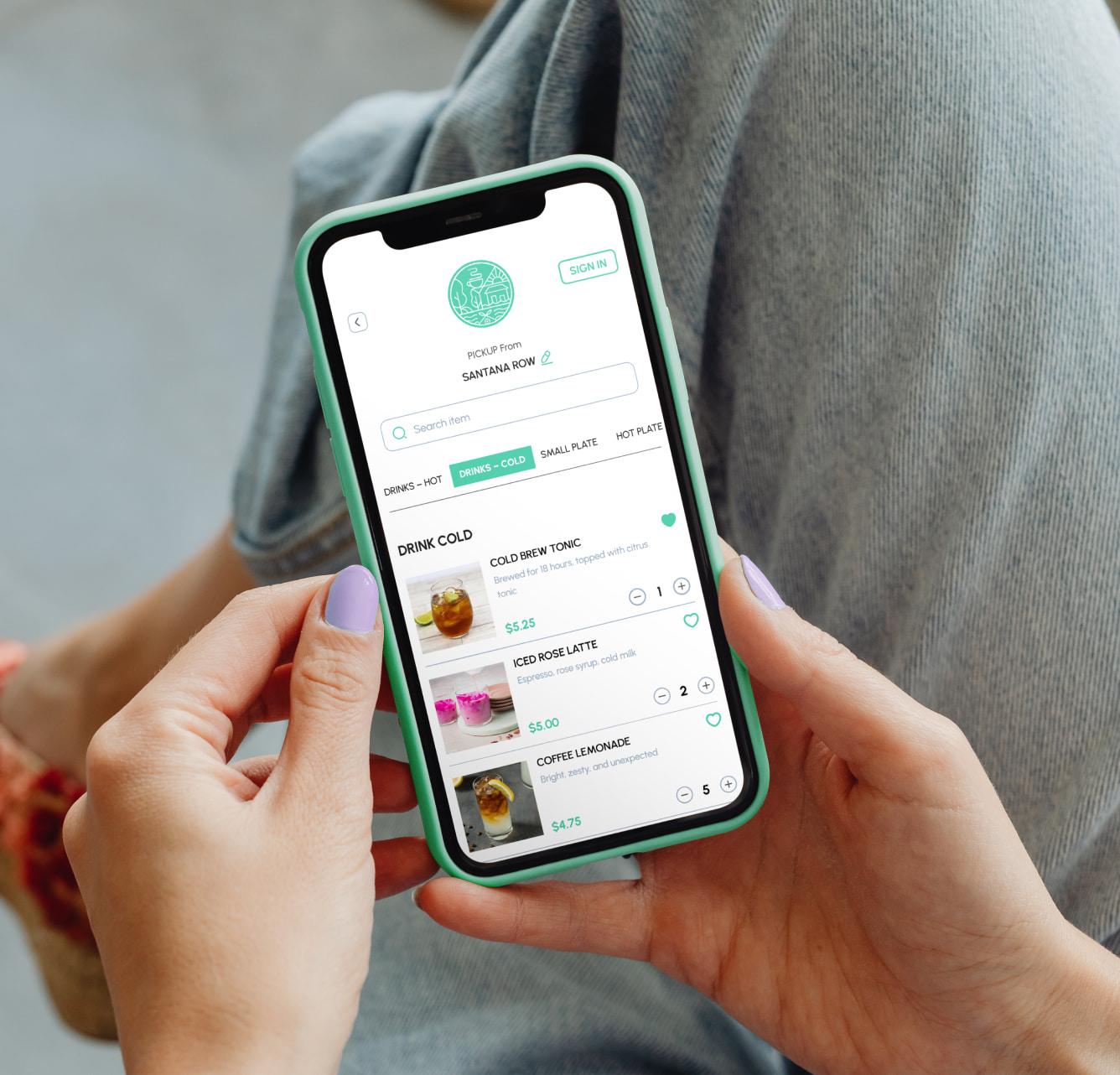
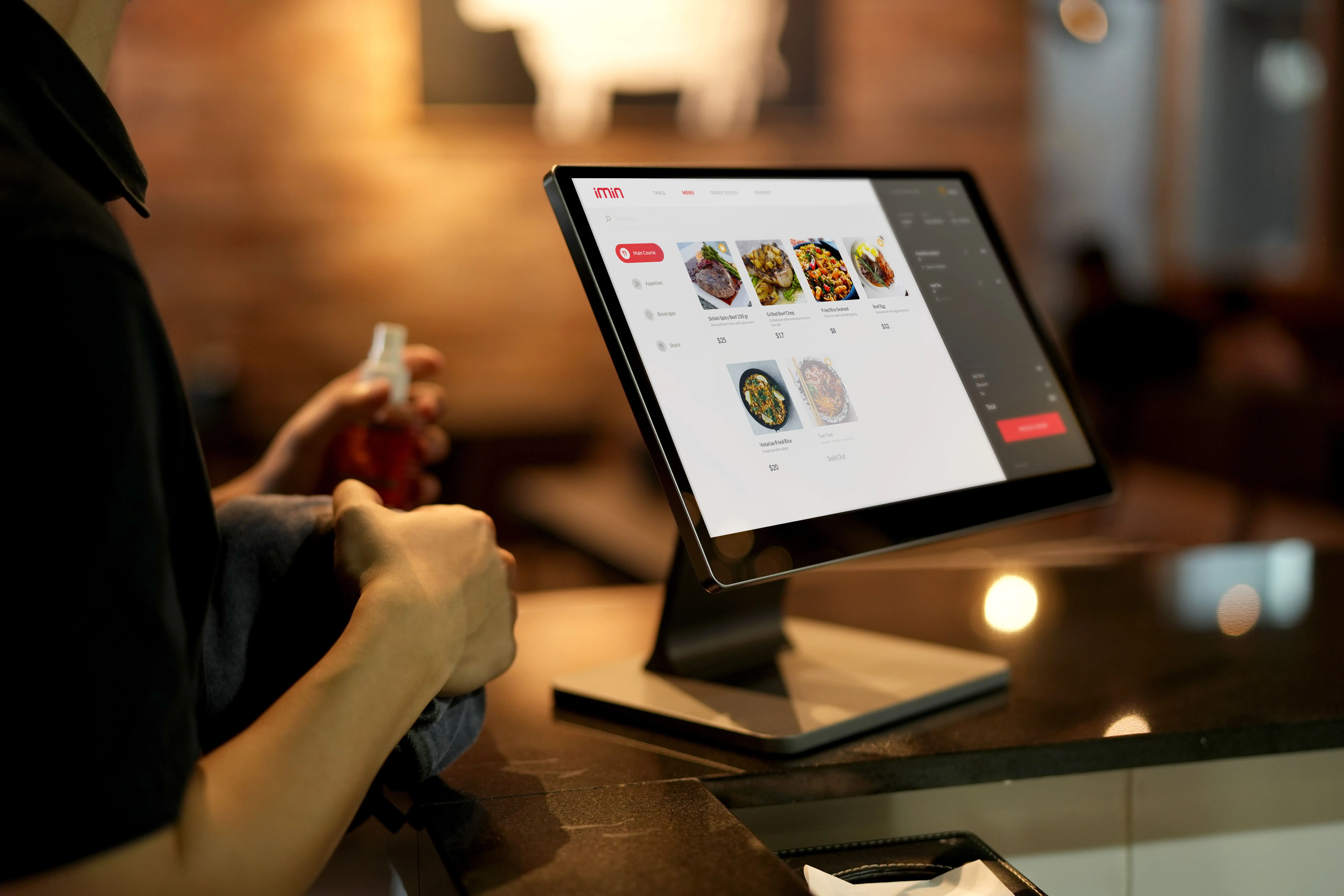
An online ordering system is a digital platform that allows customers to browse your restaurant's menu, customize items, and place orders directly through your website or mobile app—eliminating the need for phone calls or in-person visits. In today's digital-first world, this capability has shifted from a luxury to a necessity.
Beyond revenue, online ordering systems give you direct access to valuable customer data—purchase history, preferences, and ordering patterns—which third-party delivery apps don't provide. This data becomes invaluable for personalized marketing and menu optimization. You also maintain complete control over your brand, pricing, and customer relationships, rather than paying commissions to third-party platforms.
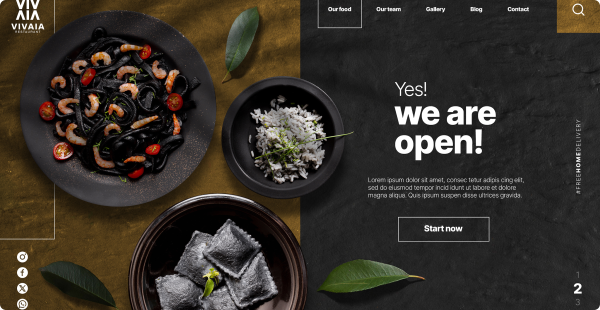
Your restaurant's website is its digital storefront, and it's how you make a lasting first impression. Whether offering online reservations, showcasing your menu, or making it easy for customers to find you, an effective website can directly influence your sales and customer loyalty.
And the best part? Building one doesn't have to be complicated or costly. With the right tools, you can create an optimized, easy-to-navigate website that works for you.
Why is a Restaurant Website Important?
Your restaurant website is essential for your business for several reasons. It will serve as a place where customers can find all the baseline information, such as your restaurant's location, menu, contact details, and operating hours.
If your website is well-optimized, it can improve your restaurant's visibility in search engines, which will attract new customers. Additionally, it could help you reach a wider audience through social media sharing.
Having a website for your restaurant also gives you a chance to tell your guests what makes your restaurant unique. You can tell your story, inspiration, values, mission, and goals, share testimonials and press coverage, and make them feel connected to your experience. .
Let's walk through the key steps to building a website. From finding inspiration and understanding your target audience to selecting the right builder, planning content, designing, optimizing, and launching—we'll cover everything you need. Let's get started!
1. Find Inspiration and Ideas
Research, creativity, and understanding what attracts customers are essential to building a great restaurant website.
- Check out your competitors' websites: Examine their layout, navigation, and features like online ordering or reservations. This will help you see what's working in your industry and spot areas for improvement.
- Use Pinterest for design ideas: Create mood boards and explore color palettes that fit your brand. Pinterest is packed with design inspiration, from branding trends to great photography, which can influence your website.
- Browse Instagram for inspiration: Search for "restaurant website designs" and discover various creative ideas. Instagram is full of restaurant brands showcasing unique and effective design elements.
- Explore Dribbble and Behance: These platforms feature top-notch design work, offering fresh layouts and innovative color schemes to help you stand out.
- Notice what's missing: As you look at different sites, pay attention to things they're missing—like poor navigation, outdated designs, or lack of social media links. These gaps are opportunities for you to improve and stand out.
When researching design inspiration specifically for your online ordering website, focus on platforms that prioritize user experience (UX) and user interface (UI) best practices. The most effective ordering interfaces share several key design elements:
- Clear Menu Organization: Look at how platforms like Squarespace and Orderable structure menus into logical categories that customers can quickly navigate. The best designs use intuitive grouping (appetizers, mains, desserts) with clear visual hierarchy.
- Mobile-First Design: With over 60% of online orders coming from mobile devices, prioritize responsive design with large, easy-to-tap buttons and simplified checkout flows. Study how Jotform optimizes their ordering forms for smaller screens.
- Intuitive Cart Workflow: The path from menu browsing to order confirmation should be seamless. Notice how leading platforms handle cart management, order modifications, and checkout with minimal steps to reduce abandonment.
2. Knowing Your Audiences and Goals
A successful restaurant website isn't just about looks—it's about meeting the needs of your audience. Know who they are and what they expect to engage and convert visitors into loyal customers.
Paul Depuis 1889 is a family company built upon a foundation of time-honored production methods passed down for five generations. The clean design highlights their offerings, freshly baked products, and uses storytelling and stunning visuals to draw in visitors.
- Consider Demographics: Think about key factors like age, lifestyle, and income. For example, a fine-dining restaurant might target professionals and couples, while a fast-casual spot might appeal to Gen Z or budget-conscious diners.
- Account for Preferences & Behavior: Go beyond demographics and consider your audience's habits. Multilingual features and interactive maps are essential for tourists, while updates on loyalty programs and specials are more appealing for locals.
- Tailor Features to Audience Needs: Once you know your audience, adjust your website to suit them. Professionals prefer quick online ordering and reservations, while families might look for kid-friendly menus. Health-conscious diners will appreciate options for healthy ingredient modifiers, toppings, and customizations.
- Align Website Goals: Define and organize your website's primary goals accordingly. If your focus is increasing online orders, streamline the process and highlight appealing images of your best dishes. To boost reservations, include an easy booking system with confirmation emails. Separate these sections to ensure a smooth user experience while meeting customer needs.
- Optimize for Local Traffic: If you aim to attract foot traffic, prioritize SEO strategies and make essential information like operating hours and directions easy to find.
Understanding how different customer segments interact with your online ordering system is crucial for maximizing conversions:
- Busy Professionals: Prioritize speed and efficiency with features like saved payment methods, order history, and quick reorder options. Consider implementing scheduled ordering so they can place breakfast orders at 7 AM for pickup at 8 AM.
- Families: Offer clear allergen information, family meal bundles, and kid-friendly filtering options. Multi-language support becomes essential if you serve diverse communities.
- Health-Conscious Diners: Implement robust filtering for dietary preferences (vegetarian, vegan, gluten-free, keto) and display nutritional information prominently to help them make informed choices.
Essential accessibility features that benefit all users include screen-reader compatibility, keyboard navigation, and readable font sizes. Following ADA compliance best practices for restaurant websites and online ordering also helps create a more inclusive experience while reducing potential accessibility barriers for customers. These WCAG-compliant elements not only serve customers with disabilities but improve the overall user experience.
3. Pick the Right Domain Name and Hosting Plan
A firm domain name and the right hosting plan are crucial to building a strong online presence. A well-known example is the restaurant chain Nobu, which has locations worldwide. Its website, noburestaurants.com, has a short, easy-to-spell, and memorable domain name.
- Choose a Short, Reflective Domain Name: Keep it concise and aligned with your brand and cuisine.
- Incorporate Relevant Keywords: Add keywords like "grill" or "cafe" to your domain to improve your search rankings. Choose a relevant extension such as .com, .co.uk, or .restaurant.
- Ensure Seamless User Experience: Your website should offer an easy-to-navigate menu and reservation system, which is essential for attracting global customers.
- Select a Reliable Hosting Plan: A hosting plan for your restaurant website helps store your menu, reservations, and orders online. Most hosting providers, like Bluehost, or GoDaddy, offer plans tailored for small businesses like restaurants. Look for a reliable plan with good security, speed, and easy-to-manage features. A slow or crashing site can result in lost orders and revenue.
- Prioritize Speed and Uptime: Choose a hosting plan that guarantees fast loading times and minimal downtime, even during promotions or busy periods.
- Look for Added Features: Opt for hosting that includes free SSL certificates (for secure transactions), automatic backups, and reliable customer support to ensure smooth operations.
Performance Considerations:
- 99.9% Uptime Guarantee: Your online ordering system should be available 24/7, as customers may place orders outside business hours.
- Fast Loading Times: Pages should load in under 2 seconds. Every additional second of load time increases order abandonment by approximately 7%.
- Capacity for Traffic Spikes: Your hosting should handle increased demand during peak ordering times (lunch rush, dinner hours, weekends) without slowdowns.
4. Choose the Right Website Builder
Specialized restaurant website builders come with built-in tools designed for the food industry. These include features like online ordering, engaging menus, and reservation systems. Using these website builders saves time managing different plugins and apps. Here are some of the key features to look for when selecting a website builder:
- Menu management: A restaurant's website should enhance customer experience, engagement, and sales. Choose a builder with menu management features like easy updates, custom sections for specials, direct ordering, categorized items with descriptions, ingredient details, and dietary information. A well-structured, dynamic menu keeps customers engaged and encourages repeat visits.
- Online ordering and reservations: Investing in a user-friendly website that offers these facilities will be a great addition, as it enhances convenience and efficiency for both the customers and the business. A 2024 survey report found that 46% of Gen Z customers prefer online delivery. A website builder that integrates online ordering allows restaurants to accept orders directly from the site. This reduces the reliance on third-party platforms and also helps create a seamless experience for the customers.
- Ease of use and design flexibility: Select a website platform that is intuitive and accessible for non-technical users. It should offer easy navigation and customizable design options for fonts, colors, layouts, and images, enabling the creation of a visually appealing website without the need for technical expertise.
- White-glove setup: When selecting a website builder, white-glove service offers complete support, from design to ongoing maintenance. Vendors provide expert customization, content integration, and ensure the site aligns with your restaurant's vision, letting you focus on running your business while they handle the tech.
- Pricing and integrations: When choosing a website builder, ensure the pricing plans fit your budget and cover essential features, along with premium options like advanced analytics and custom designs. Also, verify that the builder integrates key restaurant tools such as reservation management, online ordering, and point-of-sale systems for streamlined operations.
- Mobile responsiveness: With many customers browsing on smartphones, it's essential that your website is mobile-friendly. Ensure the website builder offers a mobile-responsive design that adapts to various screens and provides an optimal user experience. A responsive site also boosts SEO rankings, as search engines prioritize mobile-friendly sites, while improving customer engagement by reducing frustration.
5. Planning Your Website Map
Once you have decided on the website builder you want, the next obvious step is determining your site map. A sitemap is a structured list or blueprint of a website's pages and content, designed to help search engines and users navigate the site efficiently. The sitemap of your restaurant's website should reflect your business's services, goals and mission, as that helps you connect with your customers.To help you with deciding the different types of pages that you can add to your website, here are some of the pages that would be a good place to start:
- Homepage: This is your first chance to make a good impression. A restaurant homepage should have a clear, welcoming design with key elements like the restaurant's name, logo, and a call-to-action (CTA) for reservations or online ordering. It should feature high-quality images of the food and ambiance, key menu highlights, location and contact information, and customer reviews or testimonials. Easy navigation to the full menu, specials, and other important pages is essential for a seamless user experience
- Menu: This page should be the core of your website, with your selection of dishes, specials, seasonal offerings, and prices. Ensure that the menu is laid out clearly and intuitively. To improve readability, ensure that the dishes are divided by section with their photos.
- Online Ordering: This page allows customers to browse your menu, place orders, and pay directly from any device. They can also split the bill, schedule orders in advance, and leave tips. As a restaurant owner, you have full control over delivery areas and order management, all while reaching customers directly and also boosting revenue and customer retention through loyalty programs and personalized experiences.
- Reservations: Offering online reservations directly on your website lets customers book instantly, eliminating the need for calls or walk-ins. After all, 65% of customers prefer this convenience. The reservation options allow customers to pick the day, time, and party size when they book a table.
- Gallery: Giving potential customers a glimpse of your delicious food, ambiance, and events is an excellent way to incite them. You can also give them a behind-the-scenes peek into the heart of your kitchen. If you run an active Instagram account for your restaurant, you can integrate it into your website and keep your content fresh and up-to-date.
- Contact: To ensure it's easy for your customers to get in touch with you, add a contact page with all necessary information, such as your location, contact number, opening hours, email, and social media links, and make this information available in the footer of the website.
- About: This section allows you to share your restaurant's story, including the background, owner’s vision, philosophy, mission, and values. You can also introduce your chefs and team members here, giving visitors an insight into what makes your restaurant unique.
Testimonials: Adding reviews from customers who have raved about your lip-smacking dishes is a great way to showcase your exceptional service. If any publication has written a lauding review for your restaurant's service, that coverage can also be added to this section.
6. Designing a Restaurant Website That Reflects Your Brand
Designing your restaurant's website is like crafting the perfect dining experience—every element needs to align to create a seamless, memorable impression. Just as you carefully curate your menu and ambiance, your website design should reflect your brand's identity and cater to your customers' needs. Here’s website branding checklist:
- Define Your Brand's Identity: Identify your restaurant's personality—casual, trendy, or fine-dining—and reflect it through your website's layout, color schemes, and fonts to ensure alignment with your restaurant's atmosphere.
- Design a Memorable Logo: Create a logo that captures your brand's essence.
- Create a User-Friendly Layout: Ensure your website's layout is easy to navigate.
- Incorporate Prominent CTAs: Strategically place calls-to-action like "View Menu," "Book a Table," or "Order Online" on every page to drive conversions and improve user experience.
- Optimize for Mobile: Ensure your website is responsive and mobile-friendly, with easily accessible sections like online ordering, reservations, and directions on smaller screens.
- Choose Fonts that Align with Your Brand: Select fonts that reflect your restaurant's personality while ensuring readability across devices.
- Pick the Right Colors: Limit your color palette to one primary color and two or three accent colors. Choose colors that evoke the right emotions—red and orange for energy and appetite stimulation (ideal for fast food), blue and green for calm and freshness (perfect for health-focused restaurants), and neutral tones like white or beige for minimalism and elegance (great for fine-dining).
7. Optimize Your SEO
Once your website has all the pages and content, it must be appropriately optimized to rank higher in the search engine results.
- Use Relevant Keywords: Research and incorporate keywords that potential customers will likely search for when looking for a restaurant like yours. For example, a Thai restaurant in New York should use terms like "Best Thai restaurant in New York" or "Thai food delivery in New York" within your website content and FAQ sections.
- Optimize Your Google Business Profile (GBP): Set up and maintain an accurate Google Business Profile with the correct name, address, and phone number (NAP) to improve local search ranking and encourage click-to-call actions.
- Optimize Meta Titles and Descriptions: Ensure each website page has a unique meta title and description, incorporating relevant keywords. These elements appear in search results and influence click-through rates.
- Leverage Reviews and User-Generated Content: Positive reviews, photos, and user-generated content not only build credibility but also enhance your website's search rankings, showing search engines that your restaurant is trusted and popular.
- Improve Website Speed: A fast-loading website is crucial for both SEO and user experience. Slow websites hurt rankings and drive visitors away. Invest in a reliable hosting plan, optimize images, and streamline your site to improve performance and customer satisfaction.
8. Test and Launch Website
Thorough testing is crucial before making your restaurant's website live to ensure everything works smoothly. A meticulous quality assurance process will help you identify and resolve issues before your customers do. Here's a step-by-step approach to testing and launching your website like a pro.
- Conduct Integration Testing: Verify that all individual components of your website work together seamlessly, ensuring a smooth user experience across different functions.
- Test Device Compatibility & Cross-Browser Functionality: Ensure your website delivers a consistent experience across different devices and browsers, providing a seamless experience for all visitors.
- Focus on Website Speed: A slow website can frustrate visitors and harm user experience. Prioritize speed testing to ensure optimal performance.
- Conduct Security Testing: Test your website's security to ensure sensitive customer data is secure. Implement SSL certificates and enforce HTTPS for safe transactions.
- Test Functional Elements: Verify that all links, payment gateways, and reservation systems are working correctly. Check for spelling mistakes, broken links, or any other errors.
9. Post-launch Strategies for Long-term Success
Like maintaining the perfect dining experience, your website requires ongoing attention and refinement. Here are some ways you can optimize performance, engage your audience, and drive sustained growth post-launch:
- Monitor & Optimize Website Performance: Keep an eye on your website's performance post-launch. Regularly track user feedback, fix any technical issues, and test key features like the menu, reservations, and online ordering to ensure everything runs smoothly.
- Keep Content Fresh & Engaging: Update your website using customer insights with new content like blogs, event updates, and special offers to keep customers engaged and coming back. Ensure your social media and website reflect the same updates for consistency.
- Use Analytics to Track Key Metrics: Use analytics tools to monitor traffic, conversion rates, and user behavior. Regularly adjust your SEO strategy and content to improve rankings and drive more organic traffic.
- Stay on Top of Customer Service: Offer responsive customer service to build strong relationships and promptly address concerns. Active engagement helps create loyal customers.
Conclusion:
Why Choose RestoLabs A website is essential for your restaurant to grow, attract new customers, and increase revenue. Making a website for your restaurant involves time, energy and involves strategic planning, thoughtful design, and testing.
However, the benefits of making websites for your restaurants are long-term. In addition to increasing your business, it also strengthens your brand presence, simplifies online orders and reservations, and enhances customer experience.
Choosing the right website builder should be approached carefully, considering various factors like customizable templates, integrated online ordering, delivery management tools, POS and third-party integrations, loyalty programs, menu management options, multi-device compatibility, and responsive customer support discussed in this article.The right platform can enhance online visibility, increase revenue and improve customer experience.
RestoLabs stands out as a top option, offering ease of use, extensive customization, and integrated features explicitly designed for the restaurant industry.
Book a demo call today and experience how RestoLabs can help you build your restaurant's online presence into a digital dining destination your customers will love!

Sakthi Vignesh is a product and technology leader specializing in scalable solutions for the hospitality industry. As the force behind Restolabs, he focuses on building robust, user-centric platforms that help restaurants streamline operations and grow efficiently. With deep expertise in technology, product strategy, and system architecture, he drives innovation at the intersection of business and tech.
Frequently Asked Questions
Some of RestoLabs's essential features include custom branding, mobile optimization, real-time menu updates, multilingual support, POS integration, customizable online ordering and analytics.
Yes, you can create a restaurant website without technical skills using RestoLabs. RestoLabs offers an affordable white-glove setup that helps you build and customize your website according to your needs.
You can promote it through social media, optimizing for SEO, running targeted ads, encouraging customer reviews, and through loyalty programs to incentivize repeat customers and increase engagement.
You can ensure this by using responsive design, testing your website across devices, simplifying navigation, and optimizing the load speed. This will ensure that the key features, such as menus and reservations, are easily accessible on mobile phones.
.jpg)
.jpg)


.webp)

.svg)
.webp)