
.gif)

Key Takeaways
Come Sunday dinner-time and suddenly you don’t have to pore through catalogues of restaurant menus or call up your friend to enquire about the food quality of eateries. All the information you need is available at one click now. Everything arranged and organized to suit your convenience.
How wonderful would it be if technology was used to the optimum to enhance the entire thing? What if the whole online experience could also be available on our mobile screens in a much more appealing manner?
How incredibly easy life would be!
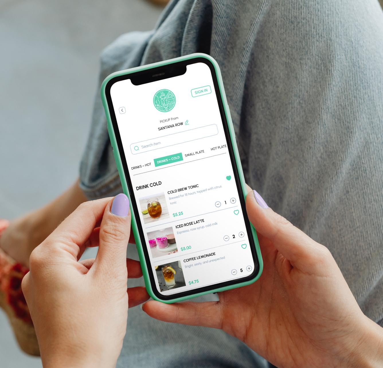
Millions of people all over the world swear by the advantages posed by online ordering systems. Over time, more and more internet users are availing the benefits of online ordering for restaurants. Sales have shot up in many food joints only and only due to restaurants’ online ordering. From their laptops and PC’s, clients are now switching to mobile phones to make the process more easy and convenient. Restaurants are even coming up with more and more custom mobile apps to popularize their online ordering systems.
How truly brilliant would it be, though, if our existing online ordering systems could be device-friendly as well?
Often users have complained about how a restaurant’s website poses problems when viewed on Smartphone.
Sometimes, content meant only for large-screens’ simply turns off when accessed via mobile phones or forces for unnecessary downloads. Others complain that the content and features provided in the website for browsers differs from that of mobile apps as the mobile-specific website often features only a subset of content found on the “normal” version of the website. This is unwanted because different users have different needs.
Recent surveys found out that our online ordering systems would be much more popular if they initiated device-friendly websites. Few methods that can be used are-
- Restaurants can introduce support systems for a variety of screen sizes and not just the extreme cases of large desktop monitors and small handheld devices so as to make online ordering for restaurants easier and better.
- Planning title pages is the most crucial thing when it comes to making device-friendly websites. The most important information should be put up on that page along with the menu which would lessen the work of the customers and make things easier for them.
- Managing the content on a website according to the device it’s meant for is something restaurants should keep in mind to popularize their online ordering systems among customers. The website will become friendlier and clients will enjoy it.
- Cutting down on the advertisements’ content in mobile websites would be a preferred option because it often bugs users. They can always be used in the original websites because having ads in mobile websites might not be a good strategy for online ordering for restaurants.
- Staying in the know-how of how customers perceive a restaurant’s mobile website’s content is a good move. It’s always beneficial to see things from their perspective.
Creating device-friendly websites is a great help as it opens a completely new window to market one’s products and services to existing and potential customers. Come what may, this way online ordering systems will always stay a huge hit with foodies everywhere!
Frequently Asked Questions


