Key Takeaways
An aesthetically pleasing and user-friendly website is one of the most important tools for branding and communication. It makes a critical part of the restaurant’s digital marketing strategy. While there can be many objectives for having a well-designed website, the primary one is to drive new business to the restaurant. To achieve this and other goals, a website design should be optimized to deliver the experience that your customers expect from your business.
These are the 5 key features every restaurant website design must-have to maximize conversions and build customer loyalty.
Tempt visitors with professional photography
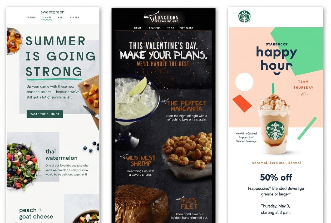
Images play an important role in any website, especially if it’s a restaurant website. Using appealing visuals including photographs of the restaurant’s interior, seating arrangements, and your best-selling dishes is a great way to entice prospective customers into your establishment. However, the developer of the website should be careful when uploading images for the web. Below are some of the guidelines which could be beneficial:
Use high-resolution images – the small detailing is what lures the visitors to order food from your website. You need a couple of high-resolution images for your website banners. If you’re using a full-screen background, team Restolabs recommends uploading an image that’s 2000 pixels wide.
Reduce the file size - using multiple high-resolution images and videos are bound to slow down the website. This hurts customers’ experience and, eventually, search engine ranking. It is advised to reduce the image size using tools such as IrfanView or Pixlr. A 125KB image is much more reasonable.
Use Alt text (Alternative text) – The description of your images should make sense to search engine crawlers. Remember this, search engine crawlers can only read the text. They can't see the images. Using Alt tags to provide a concise description for every image that you upload on your website will help Google to interpret the information correctly which will eventually give your SEO a boost.
Display key information prominently on the website
Nothing is more important than making sure your potential customers know how to reach you. Most people would visit your website to check your address, menu, timings, and contact details. If you have customers looking for your restaurant, don’t frustrate them with poor information layout, else they’ll go somewhere else!
Failure to place the key pieces of information in the right section of the website creates a bad user experience. Make sure you prominently list your name, address, and phone number in your navigation bar or in the hero section of the website. This information should clearly visible on every single page of your website.
Go an extra mile. Embed a Google map to highlight your restaurant’s address so visitors can get a clear idea of the location. In short, make it easy for your visitors to get what they’re looking for.
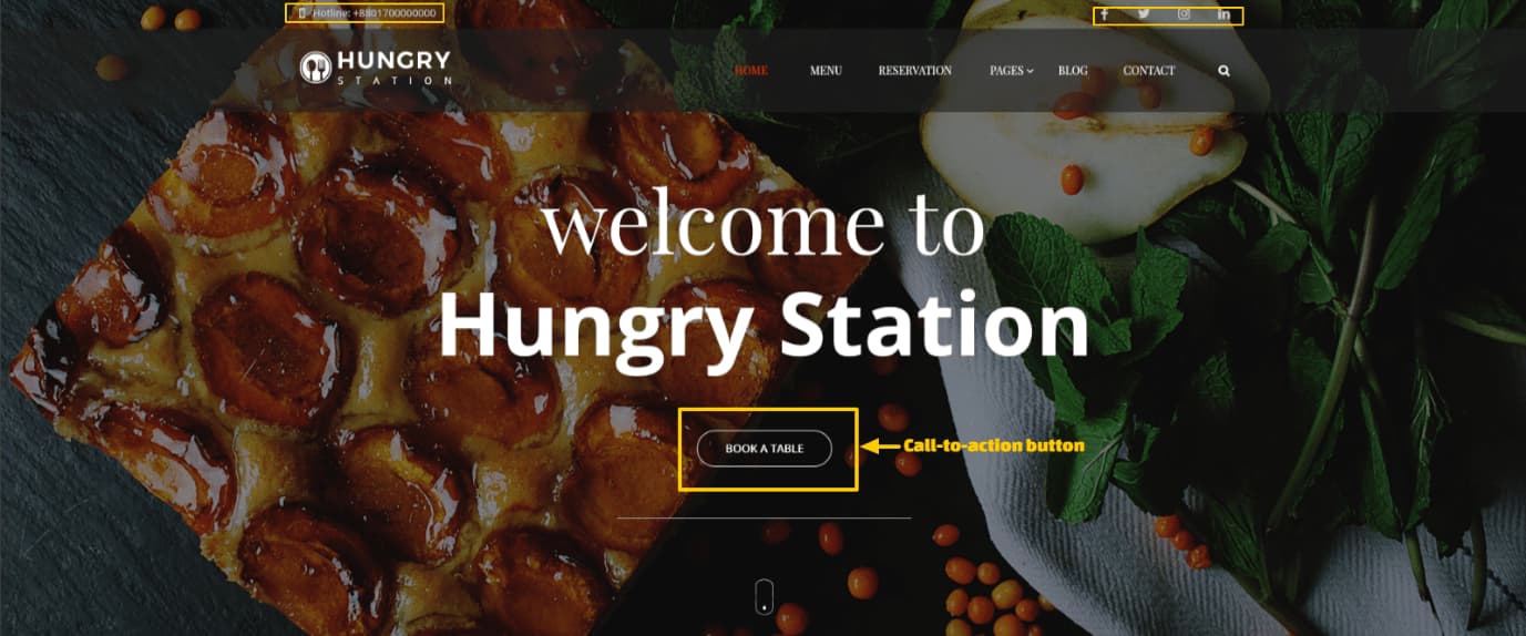
The above snapshot from restaurant themes from Themeforest.net is a great example of a good UI.
Show off your Menu
Most website designers encourage using PDF files when it comes to the menu. They often see this as a convenient shortcut. This is what you must know about PDF menu - it ’s a cardinal UI/UX sin. They not only slow down the website's speed but also negatively affect the SEO value.
Ideally, your menu should be displayed in HTML format so that search engine crawler can find and index the content. Along with it, you should use structured data and Schema markup to ensure the menu is displayed attractively across platforms. HTML menu is also mobile friendly. Since a majority of people are now accessing the internet from a mobile device, having a mobile responsive menu page is absolutely critical.
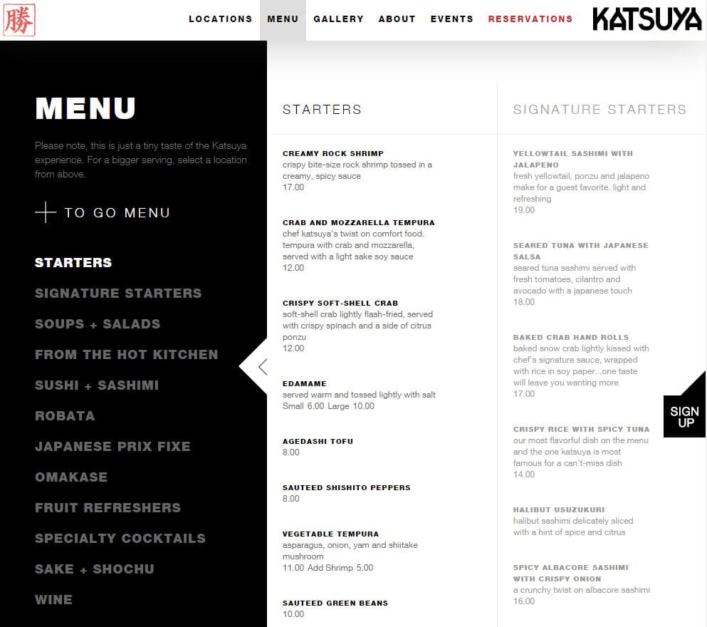
However, most restaurants, especially the startups are often required to make changes to their menu. In that case, it is advised to have both an HTML and PDF version. The below is a good example of displaying the text-only menu on the website.
Enable Online Ordering
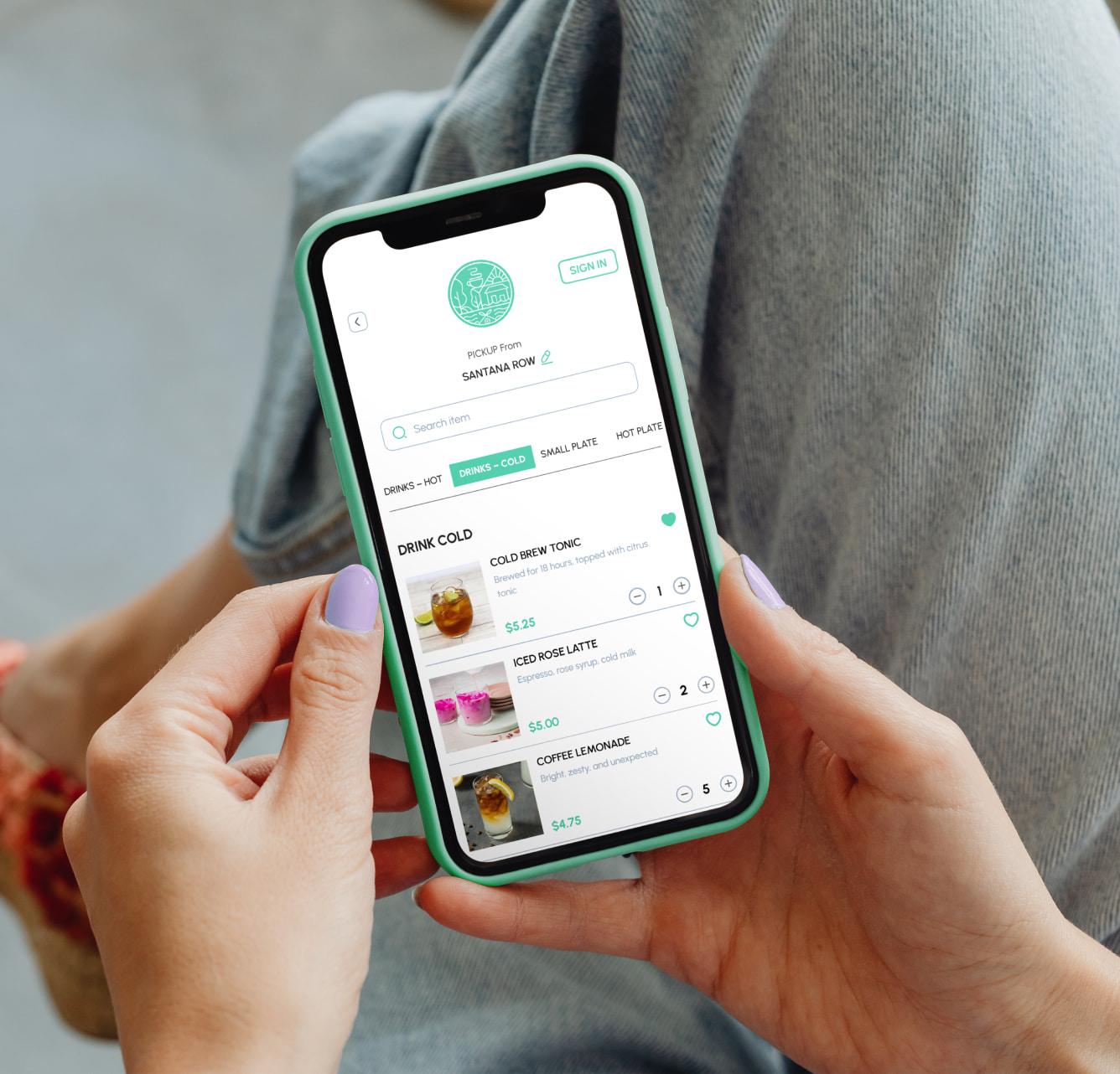
Any restaurant looking to capitalize on the shift in the food delivery industry should be focusing more on implementing and streamlining the online booking process.
Integrating a smart online ordering system is an excellent way to ease the booking process and encourage potential customers to become outright customers. Apart from offering customers the ease of ordering food directly from your website, the online ordering systems benefit restaurants in a number of other ways. Read about the benefits of online ordering system for restaurants here.
Online bookings also a present a unique opportunity for restaurants to increase their customer data. You can obtain information such as customers’ names, mobile number, email addresses, physical addresses, as well as their favorite dish and feedback on the service. If used ethically, this information can be very useful for future marketing with a view to turning occasional visitors into loyal customers.
Embrace the Power of Press
The old maxim that states it is easy to gain the trust of the audience with good PR strategy rings true for all businesses, restaurants included. If you have been in the business for more than 3 years, you would want journalists to reach you and feature your restaurant in their upcoming stories. Being open to media and press opportunities is your best bet to add credibility and visibility to your brand. Besides, having a structured good press section on the website can make a significant difference in terms of both web traffic and name recognition in the local as well as global community.
Here are 3 key elements to keep in mind when designing a press page for your restaurant website
Contact Information - If people interested in your business are not able to find a way to contact you, the next thing you know they'll be checking with another business. Put a direct phone number and e-mail address of the designated media representative you want the journalists to talk to.
Artwork - The pictures and graphics on your press page must include company's logos, a professionally clicked photo of the founder and product photos. The recommended image size for this page is 72 dpi.
Archive Content - Include a list of most important features and media materials, in chronological order. Displaying the historic value of your brand enhances the company’s reputation among customers and investors. Make sure they're optimized for all platforms.

Now your turn
Does your restaurant website have the above-mentioned 5 must-have features? Tell us which sections on your website have better conversions and which ones need improvement?
Is there anything innovative that you have recently implemented on your website that has led to an increase in conversions? Share it with us in the comments section below.
Frequently Asked Questions

.gif)



.jpg)
%20(2)%20(1)%20(1).png)
